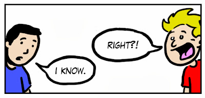
1. Try not to use more than a single word balloon for each character in a panel. In order to save space and drawing time, many cartoonists have their characters interact in long back and forth conversations within a single panel. Dividing the word balloons into separate panels and giving the conversation some room to breathe will make for better pacing and will be easier to read. There is a fear amongst cartoonists to draw “talking heads” comics, but squeezing vast amounts of dialogue into a small space creates a more boring reading experience.
2. Don’t use words where you can use pictures. I once heard designer Chip Kidd remark that if you have an image of an apple, don’t put the word “apple” underneath it; choose one or the other. Ultimately, comics are a visual medium and showing your story rather than telling it makes for more engaging storytelling. It forces your readers to do a little work; to piece things together in their heads.
3. Always keep in mind that people read left-to-right and then top-to-bottom. This is very basic theory that sounds obvious when said out loud, but I repeatedly see some of the best cartoonists in the world forget this simple rule.
This panel orientation, for example, is instinctively confusing because it doesn't follow this rule and thus can be read two different ways:
The word balloons in the panel below can be read in either direction because of their awkward positioning:
4. Use bleeds sparingly. A bleed is a powerful storytelling tool, which can evict either a sense of timelessness or the briefest of moments. If overused, or done for no real purpose other than aesthetics, then its use becomes meaningless and the power it can yield is lost.
5. Create a balance between black and white. Many young cartoonists are intimidated by the use of heavy blacks and, as a result, leave their pages looking stark and weightless. A rule of thumb I created for myself when I was first starting out was to try and give each panel a balance of 50% white and 50% black. I met Jaime Hernandez at a convention once and he told me that he doesn’t look at the balance of a single panel, but rather of the entire page. Jaime’s rule is both more sensible and practical than my own.
The bottom line is, don’t be afraid to use heavy blacks. Use them to create balance, mood, and to frame what you want to stand out in your panel.
6. Put in as much background detail as possible. Of these 10 rules, this is the one that I struggle with the most. It doesn’t matter what style you draw in, background detail will make your settings come alive and enwrap your readers into the world of your characters.
7. Art is not supposed to be perfect. There is beauty in imperfections. It makes the work human. There is something very intimate in knowing that every word on the page you’re reading was hand lettered by the person who wrote it. No other art form gives you that. It is completely unique to comics.
This is why I tend to avoid using digital panel borders and word balloons (and digital lettering when I'm not too lazy). They are too perfect and thus feel disconnected from the drawings.
8. Your top priority is to make sure your story is clear and concise. Interesting shots or layouts should not be your main concern and should never be used if they compromise the clarity of the story. A good rule of practice, in order to make sure your comics are clear and understandable, is to thumbnail a lot. Be critical of your thumbnails. Don’t get lazy and use the first one you sketch out. Test out different combinations until you find the layout that works best. Comics are difficult to edit once they are inked. Do most of your editing in your thumbnails. Draw them quickly. Use stick figures. They’re not supposed to be works of art.
9. Reference (from photographs or real life) as much as possible. All I can say is, thank god for Google Images. Take advantage of how easy it is to photo reference things in the present age. Back in the day, all cartoonists had photo albums of random objects and subscriptions to National Geographic.
Be cautious though of copying photos exactly. Referencing is not the same thing as copying. This carelessness can lead to all sorts of problems including tangent lines, stiff cartooning, and boring compositions.
10. Be conscious of how your work will be viewed. If you’re putting your work on the internet, make sure it’s sized in a way that fits well on a computer screen. If you’re printing a book, be aware of how your pages are juxtaposed next to each other. For example, if you have a bleed in the top panel of page 2, don’t have a bleed in the top panel of page 3. They will bleed into each other and form a tangent. If you are reprinting a Chris Ware comic, don’t shrink it down and squeeze it into your tiny anthology. Be courteous to the fact that it was meant to be viewed in a larger format.
You can view Dov Torbin's work at: www.dovtorbin.com


